
Lynx
Lynx is a calendar application enabling multi-calendar synchronization and streamlined coordination of availability. Development began in 2020, and our current team consists of four members: a product owner, two backend engineers, and myself. We are currently preparing a beta release of the Workspace feature, which consolidates calendars from different individuals and organizations into a single view.

The need to manage multiple calendars is not unique to Lynx users—it is a common challenge among people who operate across several roles and communities: work, personal, freelance, and team-based collaborations. In Workspaces especially, projects often bring together people from different organizations. Designing a UI that allows visibility into everyone’s availability in one place became essential.
As a designer and frontend engineer, I led the comprehensive redesign of the application over the past year. My work bridged both design and implementation, guided by principles such as: preserving the user’s context, reflecting settings changes in real time, enabling understanding through interaction and clear visual expression rather than explanation, and evaluating design within a live environment rather than static mockups.
I hold core beliefs that shaped nearly every decision in the redesign: users should be able to reference their schedule while adjusting settings, invisible concepts should become tangible through interaction, the priority is user understanding rather than information display, UI is a form of reasoning rather than decoration, and design operates across time as much as space.
The first major effort was rebuilding our UI component library. Previous components were structurally inconsistent and often behaved unpredictably. I reconstructed them beginning with fundamental components—Text, Button, etc.—and extending into composite components like Stack and Dialog, establishing unified specifications, design guidelines, and implementation patterns.
This consolidation reduced styling redundancy, increased reusability of core UI elements, clarified state management, and created a foundation where new features inherit not only visual consistency but consistent design principles. As a result, maintainability and development velocity improved significantly.
For Look & Feel, I focused on improving readability and interaction responsiveness. One major initiative was reorganizing the visual structure of scheduled items in the calendar to maximize how much information can be understood at a glance. Carefully designed micro-interactions and thoughtful animations enhanced feedback during interaction, leading to a more intuitive, modern feel.
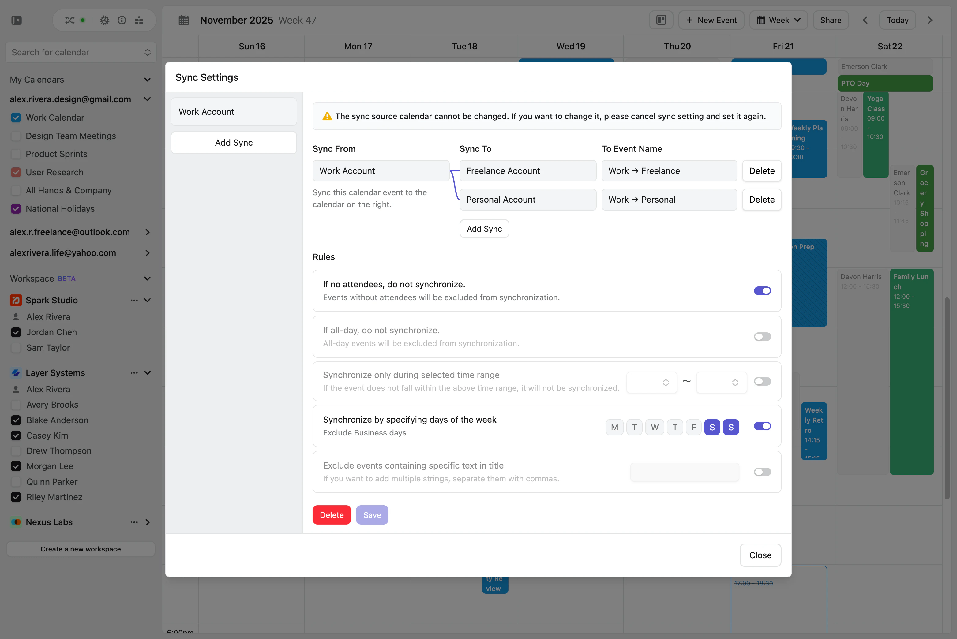
Settings UX required a fundamental shift. Previously, configuration occurred in a separate page that obscured the calendar entirely, removing both temporal context and visual reference.
I redesigned this into a dialog-based interface that preserves visibility of the calendar at all times. This allows users to adjust settings while still anchored in their actual schedule, and see changes reflected in real time, which fundamentally improved continuity and user confidence.
I also reworked onboarding to communicate Lynx’s value through interaction rather than text. Concepts such as “synchronization” are abstract when read, but immediately clear when experienced. The new onboarding flow improved comprehension speed for new users, and we received direct feedback affirming this improvement.
During development of Workspace, we initially separated synchronized calendars and workspace calendars, but encountered issues including fragmented experience, functional inconsistency, and duplicated implementation. Ultimately, we merged them into a unified calendar model that supports both use cases seamlessly.
Throughout this process, building prototypes directly inside the development environment—and reviewing them live with screen-shared interaction—proved invaluable. It enabled fast iteration grounded in real behavior, not hypothetical UX.
Before working on Lynx, I had minimal experience with Vue.js, but I had worked in roles on both ends of the spectrum: as a designer who writes some code, and as an engineer who provides technical feedback to designers. On Lynx, however, I worked at a true midpoint—50% designer, 50% engineer.
This allowed me to understand UI not only visually, but structurally through code. Today, I rarely use Figma except for lightweight assets such as icons. Instead, I treat the development environment itself as my design space. Working directly with live components and mock data allows me to evaluate interaction quality immediately, and collaborate with backend engineers with greater clarity and precision.