
Metapa
Metapa(メタパ) is a Metaverse mobile application that provides a completely new shopping experience, allowing users to view products and interact with actual store employees while controlling their own avatar in an online store that is a 3D version of a real store. Future updates will expand new stores in a variety of genres. It will also allow users to shop with friends while talking in groups.
As a designer, I was responsible for planning, research, and UI concept design. I designed not only general navigation UI but also UI for navigating through 3D space.
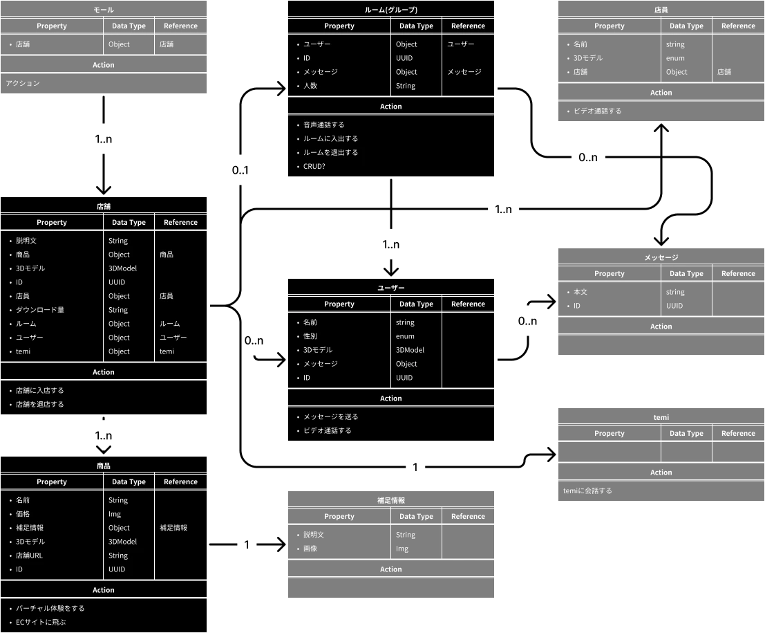
Firsly, since the previous version was not well-organized from the standpoint of information architecture, we started off by clarifying the core objects users should interact with and the whole structure of the application, using a UML diagram-like chart below.
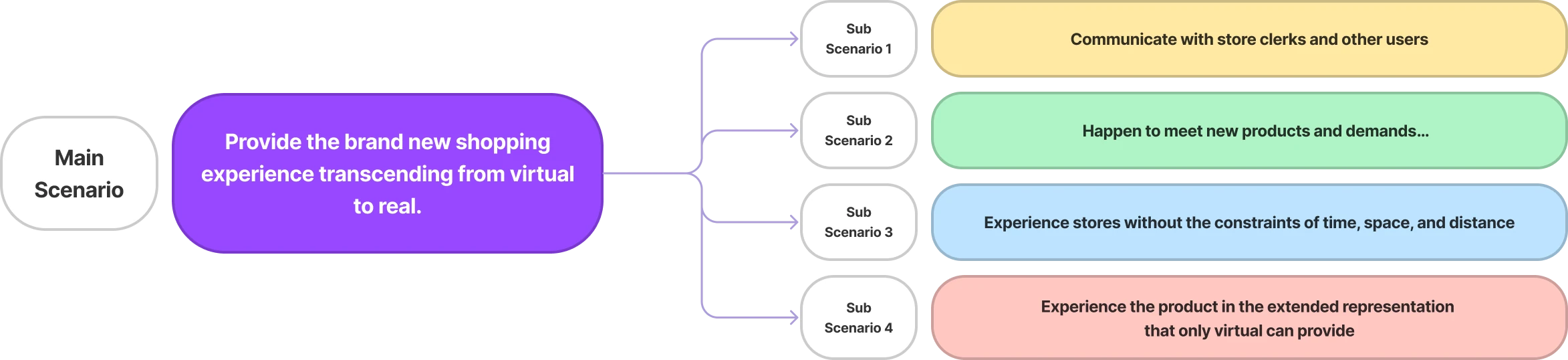
While identifying the central objects of the application, we have articulated the main user storie of the service with the sub scenarios that will accomplish it. The main scenario was defined as providing a completely new shopping experience that transcends the virtual and real world and four sub-scenarios were defined to support it. By comparing these scenarios with the objects defined above, and considering which objects should be placed where, we defined how the scenarios would be achieved in the application.
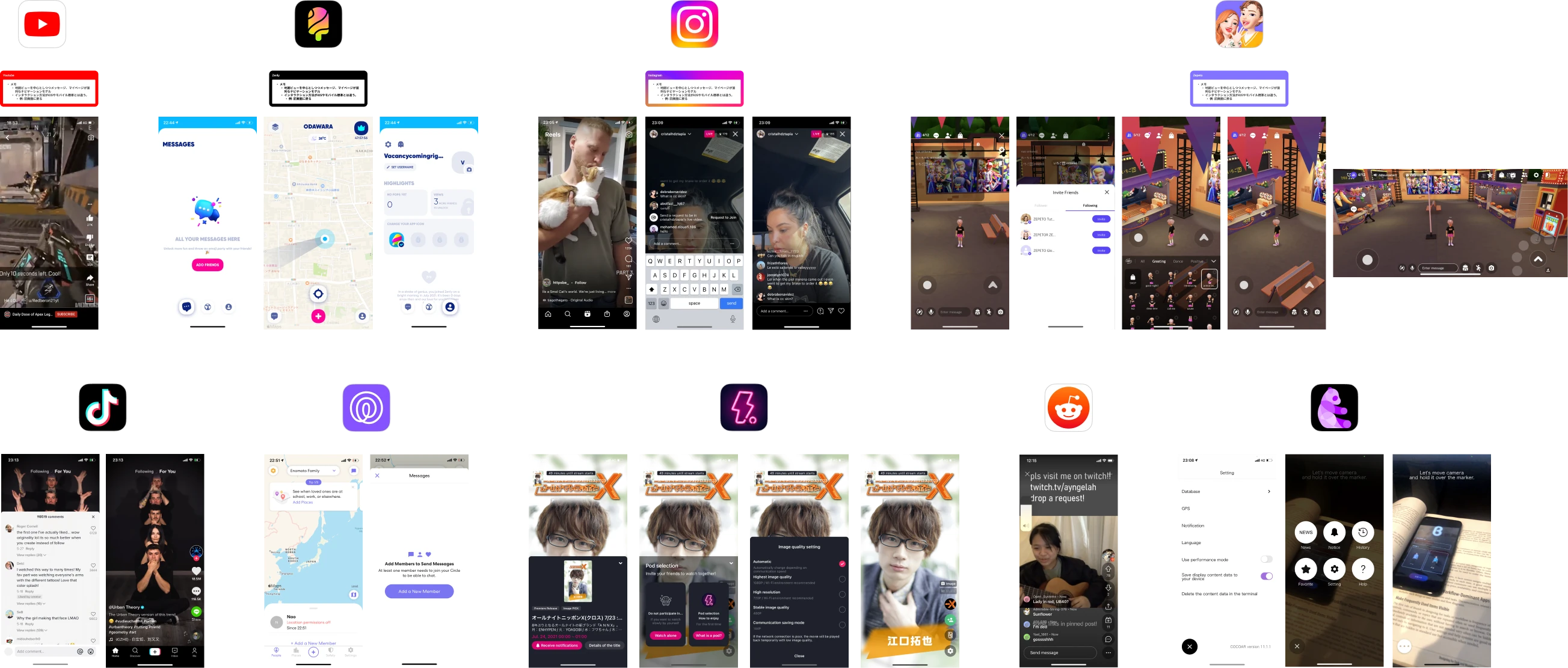
After solidifying the objects and user scenarios that would form the basis of the application, we began researching other applications, including applications with similar concepts such as Zepeto, but with Metapa’s main content being 3D data from stores, avatars, and products. We also selected applications such as Instagram and Zenly, whose main content is non-text-based information.
Research has shown that many applications are designed to fill the screen with primary content and include controls that do not interfere with interaction with that content. These designs are highly successful in creating a sense ofimmersion that keeps users on the application for a long time. Following these designs, Metapa has decided to focus on UI design centered on 3D content.
After research followed by wire framing, we began designing the UI for actual development. Since Metapa is actually a shopping application with some game-like elements that are common in metaverse applications, we needed to consider the mental model for using other applications in general. In addition, since the implementation was done in Unity, we had to proceed with caution because there were many things that could be achieved with other common UI frameworks that could not be done with Metapa.
As mentioned earlier, the key to Metapa is immersion, which is reinforced by the beautiful 3D graphics, so the 2D UI needed to be designed in such a way that it would not interfere with the immersive experience. We, engineers and designers worked hard and created many working prototypes in order to design interactions that would not feel disconnected from the 3D content.
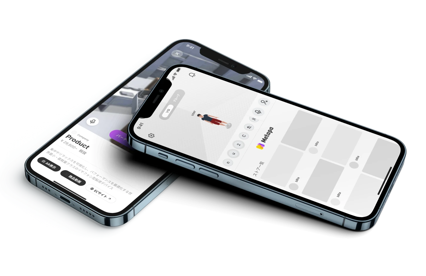
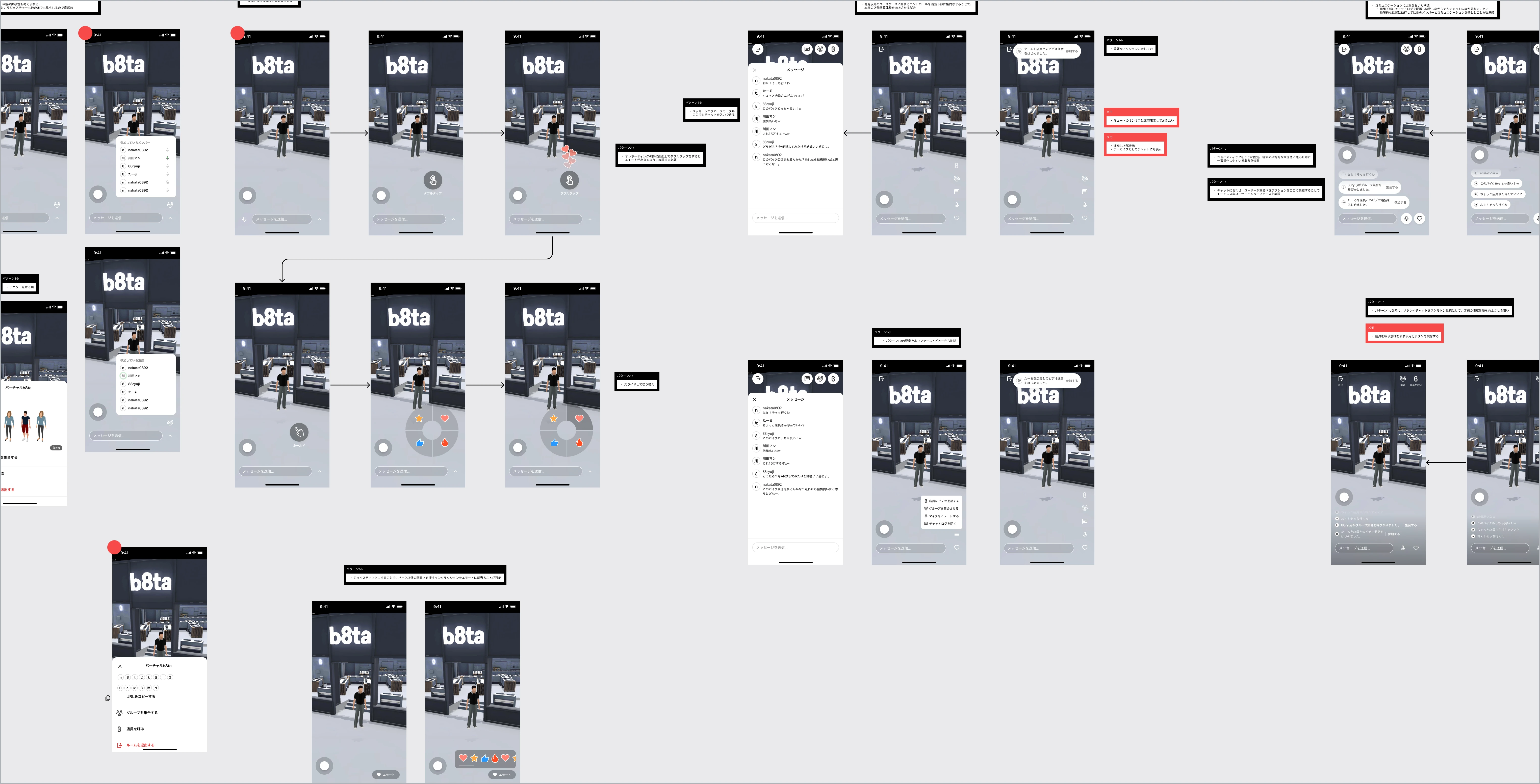
This section details the Metapa user interface. The first section to be explained is where the group decides which stores to shop at. This screen is divided into four main areas. *This screen is not yet implemented.
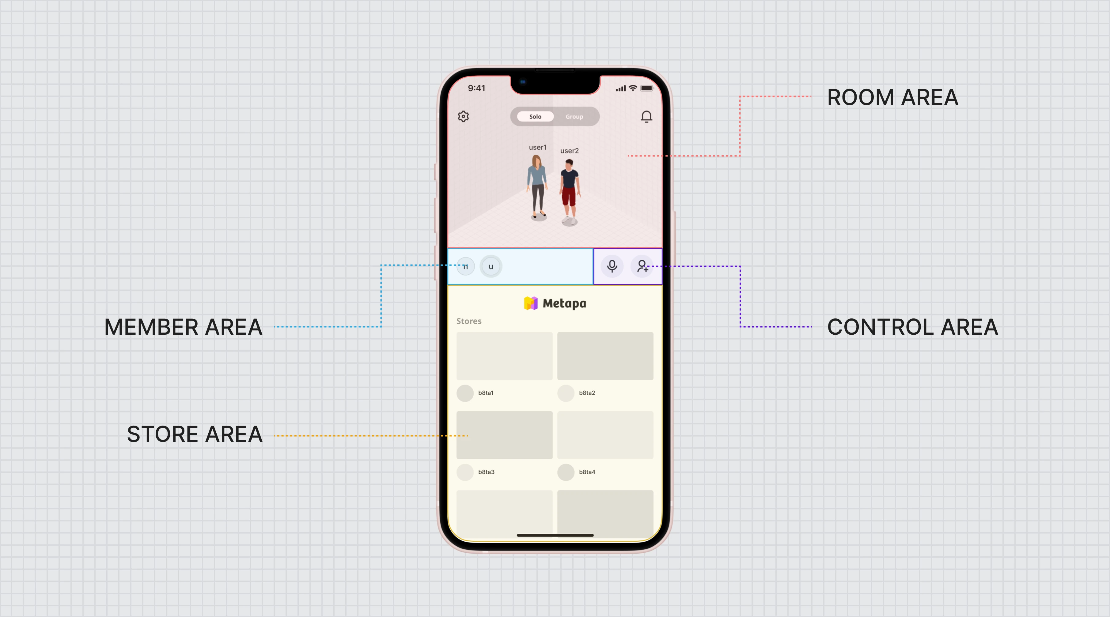
The room area is where the group in the room is displayed. Here you can access settings and use the toggles at the top of the screen to decide whether to shop alone or in a group. To achieve an overwhelmingly immersive experience, the display area is designed to bisect the store list area below, and the avatars in the area are designed to move around on their own. This allows users to feel as if the avatars are alive and can be observed like fish in an aquarium.
The member area is the area to see the participants in the group in a list format. An icon with the first letter of the participant’s name is displayed and can be scrolled horizontally if the list is longer than the display area. Participants can make voice calls within the group, and a wavy effect will appear around the icon of the participant who made the voice call. This makes it easier to see who is speaking in the group.
The control area is where you can mute the audio and add users to the group. It is fixed and always visible, regardless of the length of the list of participants.
The store area area displays a list of stores where you can shop. If the list of stores exceeds the display area, you can scroll vertically.
The in-store screen focuses on the detail of the in-store screen. People can enjoy shopping while talking with their friends, and they can also ask store clerks about products whenever store clerks are present in a store.
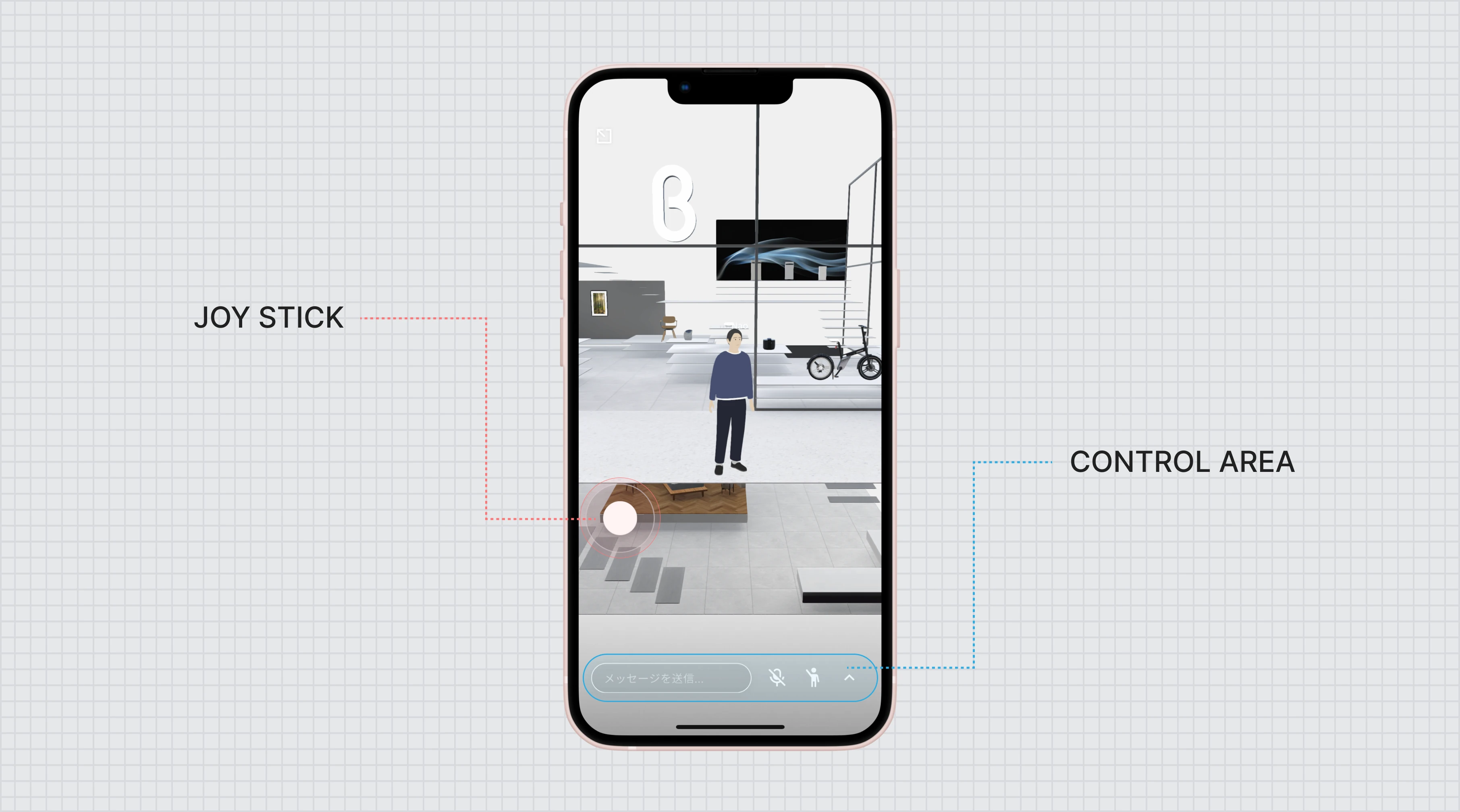
We had two options that bothered us about how to move the avatar. One was to tap on the place you want the avatar to go and it would automatically go there. While this was intuitive, it also made it difficult to control the viewpoint in the 3D model of the store, and it was also problematic because the tap would be used to select products.
So we adopted a joystick, which was the remaining option. Joysticks can be found on most game consoles, and you don’t need to look at a manual to know how to use one. They are excellent because you can control the viewpoint with one hand while still being able to control the game with the other. Also, unlike the up/down/left/right buttons, they do not occupy more of the display area than necessary.
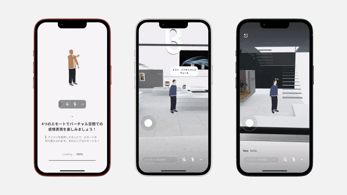
In the control area, you can access each setting, control voice, and send chats. Since voice control is already available, the chat is placed on the left side, furthest from the right hand side. The most important button is the button to emote. Emoting is one of the easiest and most emotional ways to communicate in the Metaverse, and Metapa considered it important.
A long press on the emote button will display a list to switch the emote to be activated with a single tap. This allows users to access their favorite emotes faster.
Metapa was our first Unity application and we had a bit of a development challenge. However, as a designer, I concentrated on creating a simple UI and pursuing the feeling of immersing the user in 3D content. I am looking forward to the future as the number of stores increases and the service improves.