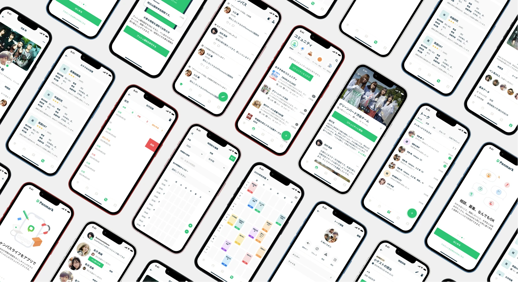
Penmark
Penmark is a mobile social media application for college students. With Penmark, they can share the information which connects them such as their class schedule, tips for tests, and their social life on campus. We, the team, worked on the revamp of the application and visual identity.
responsible for UI visual design, visual identities, and logo design while collaborating with another designer who was in charge of wireframing and the navigation system design.
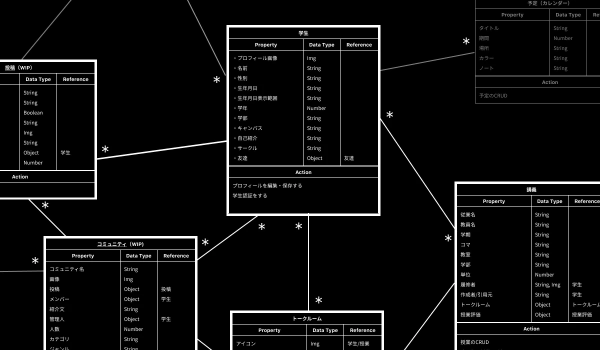
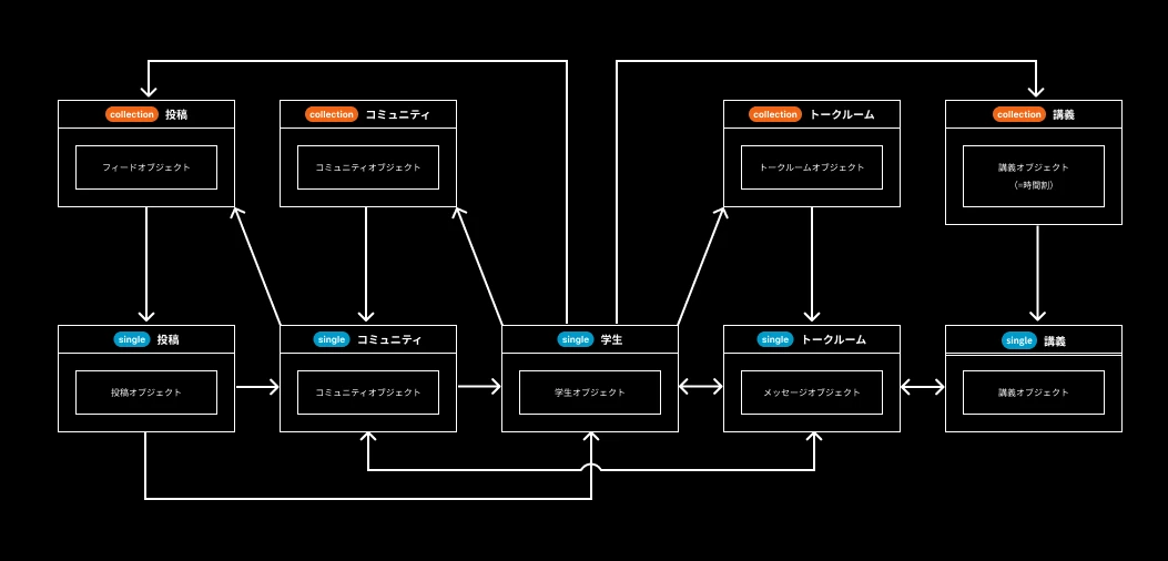
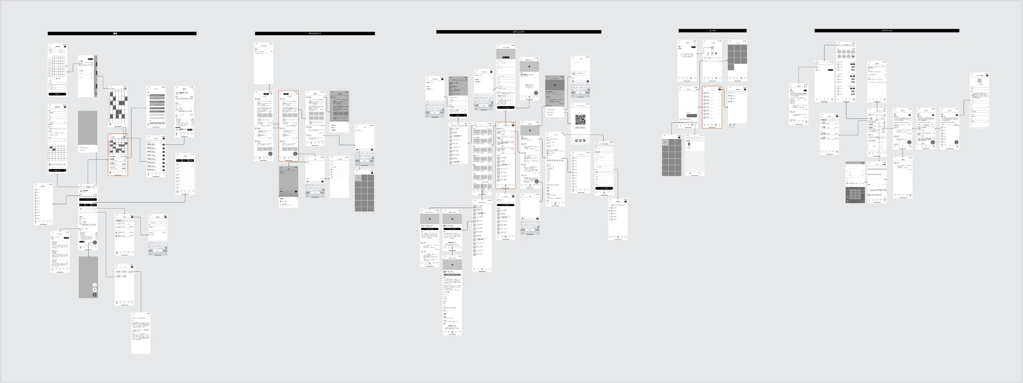
Since the previous version was not well-organized from the standpoint of information architecture, we started off by clarifying the core objects users should interact with and the whole structure of the application, using a UML diagram-like chart below.
After that, we worked on the navigation system with the reference to user scenarios. Like the previous version, the Tab-Bar style navigation was suitable in this version since there are enough objects to be interacted for the Tab Bar.
Since the projects was a bit large in scale, we had two designers. The other designer was in charge of wireframing whereas I was responsible for the UI visual design in advance. Therefore, I took a detour from user interface design and focused on visual design for the UI and corporate.
After a couple of iterations with the team and client, I concluded it with the final concept for the visual design, which states that Penmark is the virtual campus where students are allowed to safely build their own communities just like a physical college campus. We picked green as the key color that symbolizes the safe and lively place.
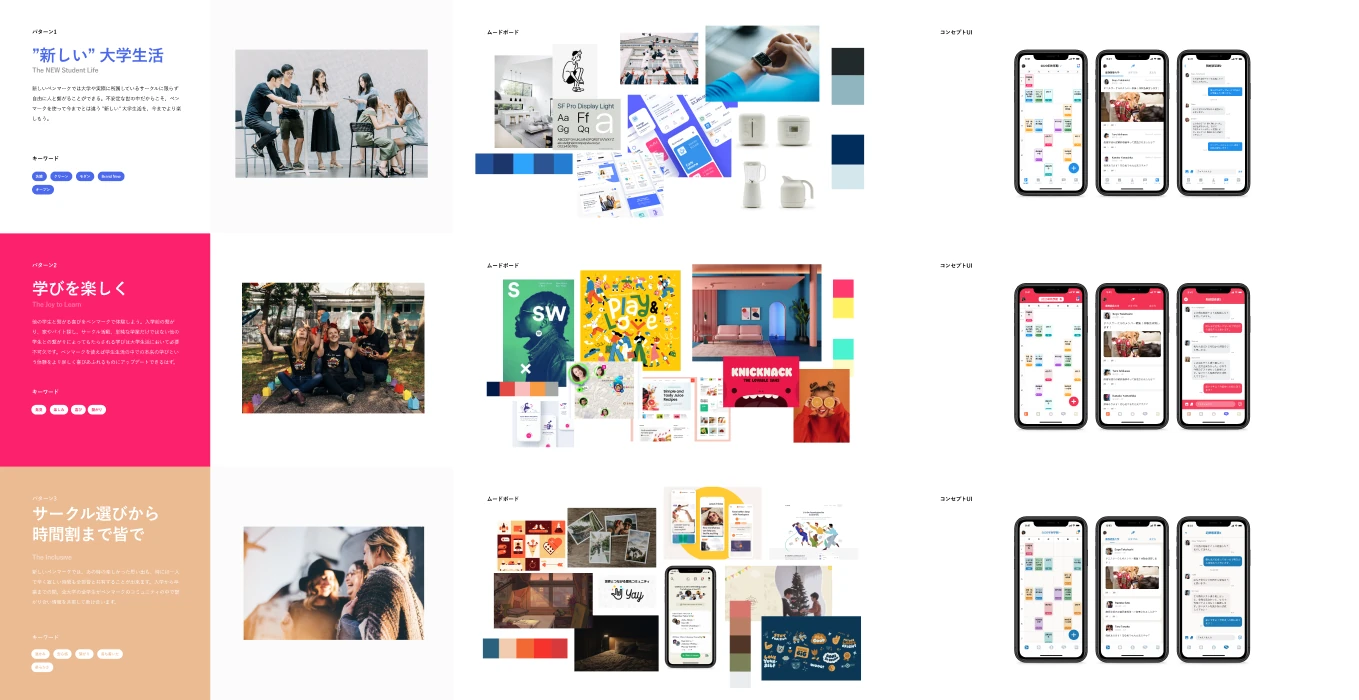
After a couple of iterations with the team and client, I concluded it with the final concept for the visual design, which states that Penmark is the virtual campus where students are allowed to safely build their own communities just like a physical college campus. We picked green as the key color that symbolizes the safe and lively place.

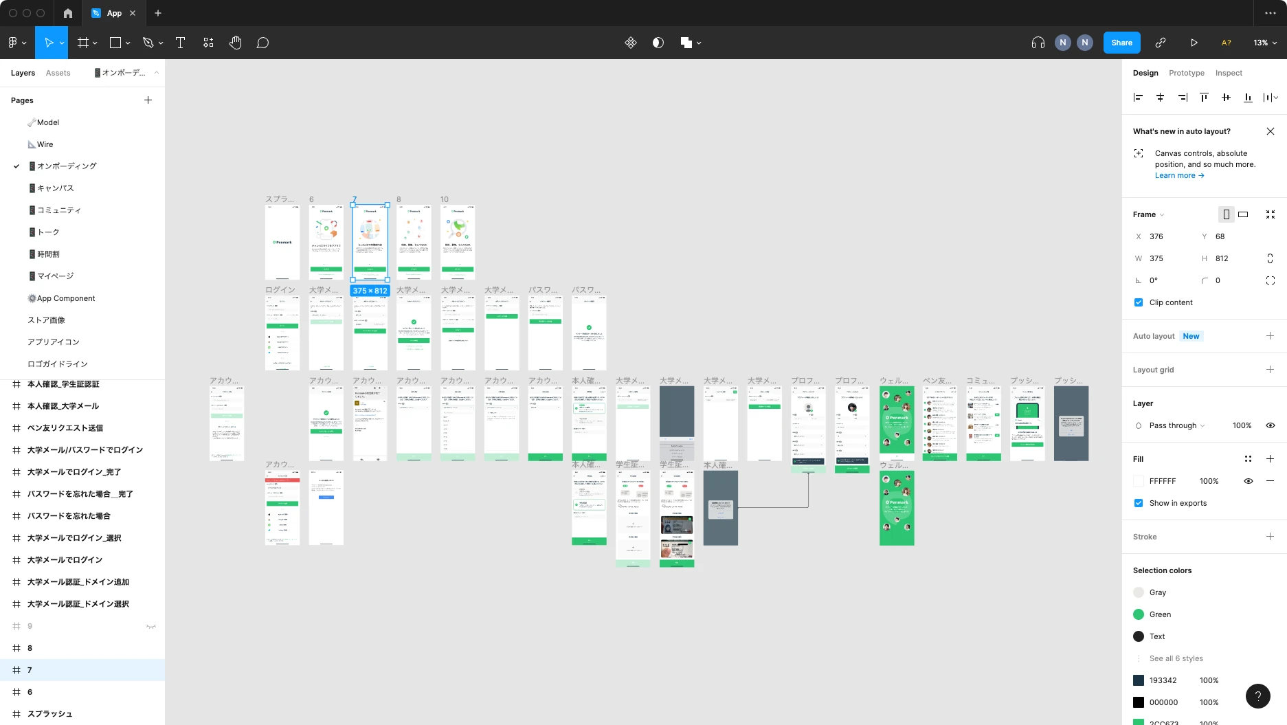
Penmark is developed in Flutter. Therefore, from the beginning, we planned to build a common user interface for iOS and Android. Since the number of screens before the renewal exceeded 500, another designer was in charge of defining screen transitions and interactions, and I was in charge of adapting the visual design.
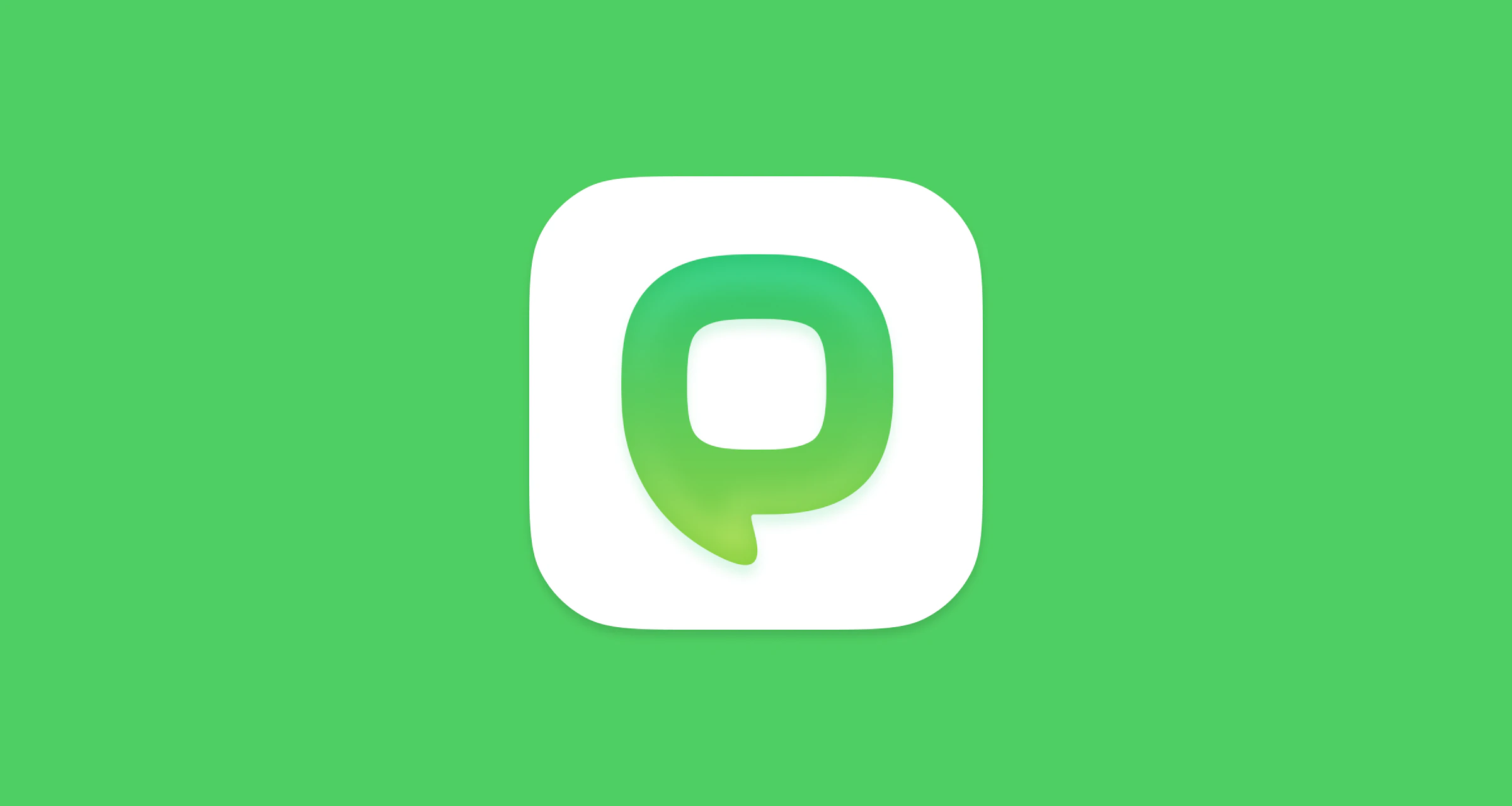
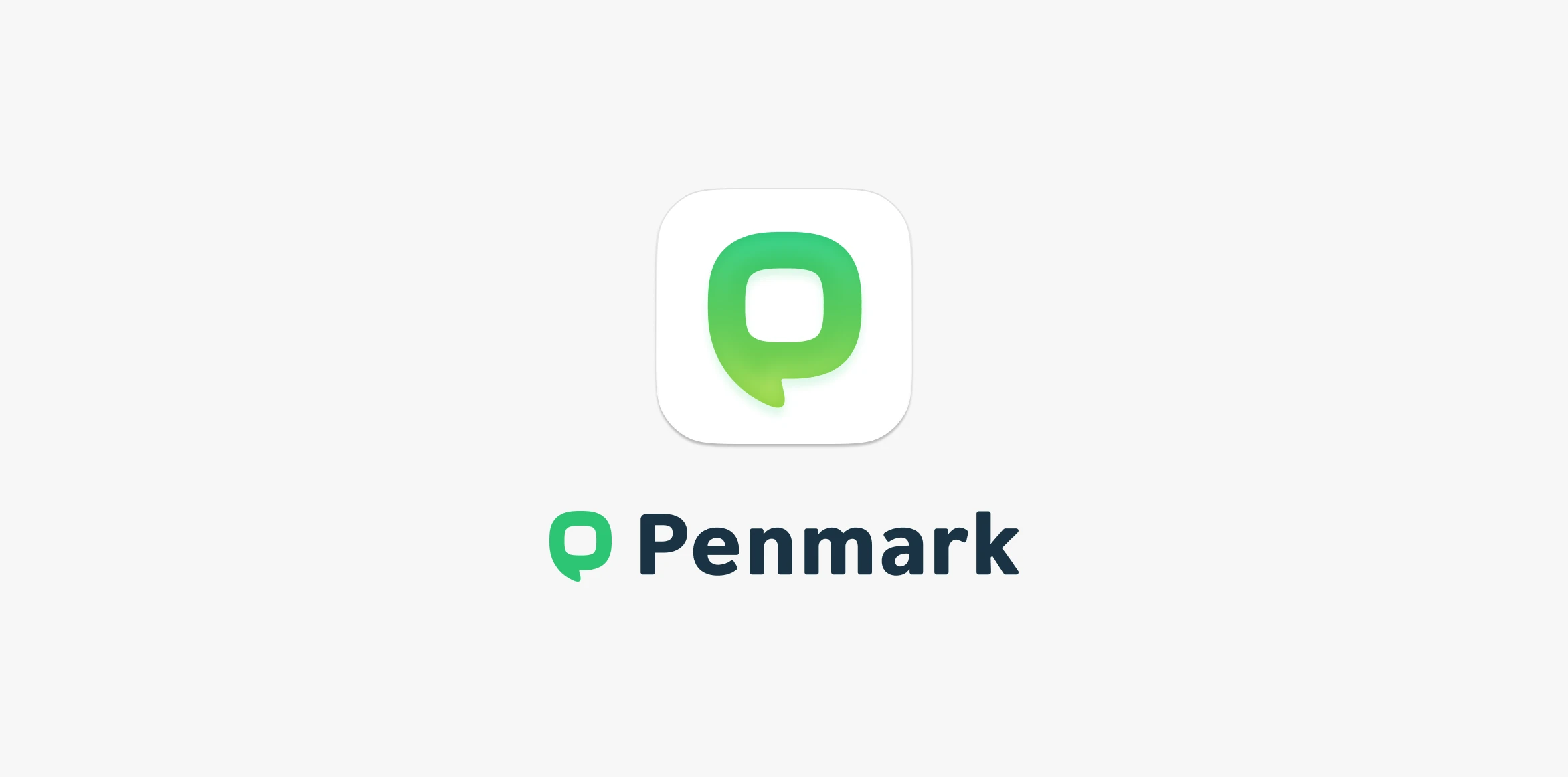
Designing a logo for Penmark was never easy. Many logo concepts were created to find a logo that would incorporate the visual concepts defined above while ensuring visibility in both the mobile application and the company logo. We also created the logo with the goal of combining a slightly more mature simplicity for college students with a fun student feel.
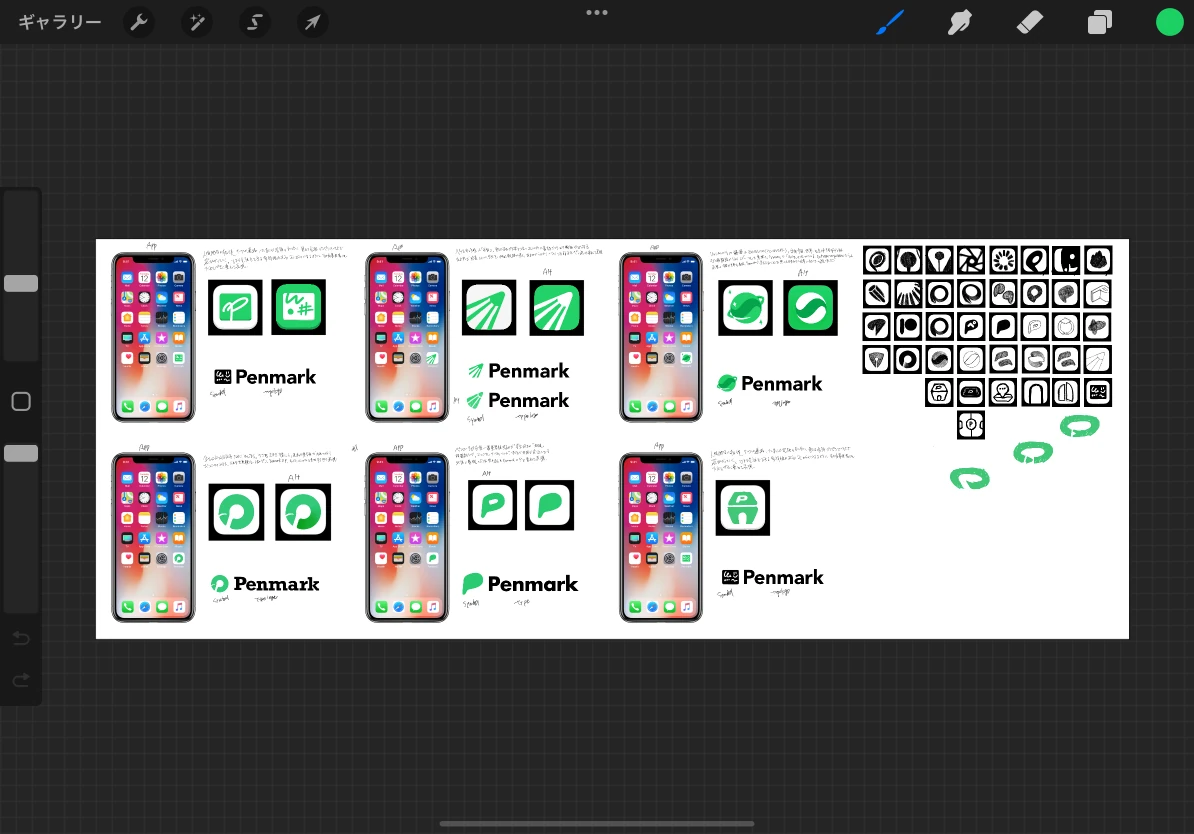
And the next image is the completed logo of Penmark. The basic shape is shaped like the initial P. The curvature was intended to be neither too square nor too round, expressing the position of a college student who is neither an independent adult nor a child. And the shape of the base represents the unity of the campus, and the descender of the P represents the nib.
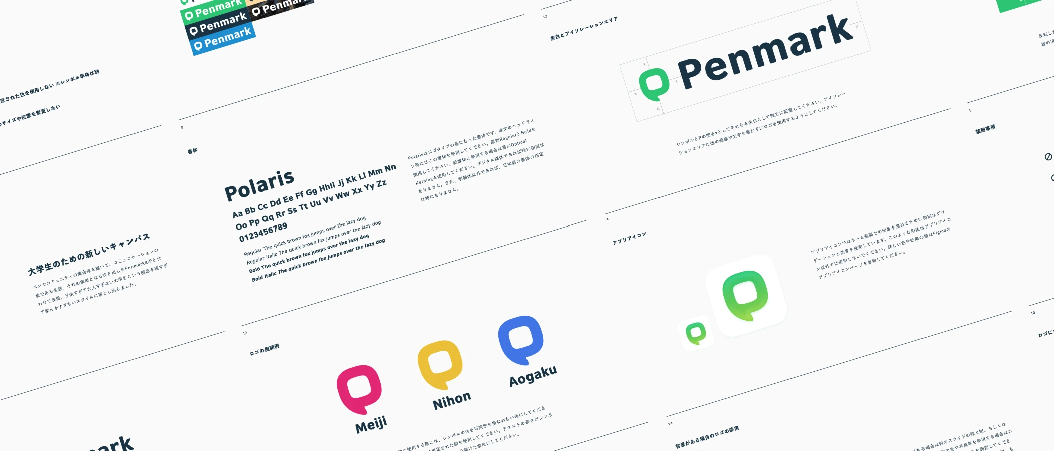
Once the logo was created, we created and provided logo guidelines to ensure that Penmark could grow while maintaining its brand.
Penmark was a fairly fast-paced project that went from planning to implementation to release in four months. In order to maintain the quality of the UI and visual identity in this environment, we had to work as a team. The plan was very successful and we were able to present the client with high quality from information design to visual design.